Make navigation easier to follow
A more considered user journey helps people move between relevant sections without unnecessary confusion. The goal is to help visitors find information instead of making them search for it.

Case Study · Website Redesign & CRO
We analysed Bin Hindi's existing website, identified UX problems and ineffective call-to-action placement, and rebuilt the experience with conversion rate optimization at its core.
When a website is not generating the conversions a business expects, it is easy to assume that the answer is more traffic, more advertising or a fresh visual design. But before investing further in acquisition, it is worth understanding what happens after a visitor lands on the website.
Can people find the information they need? Is the navigation intuitive? Do the pages explain the offering clearly? When a visitor is ready to take the next step, is the call to action visible and easy to understand?
These were the kinds of questions that guided our work with Bin Hindi. We first analysed the existing website to understand why its experience was not supporting conversions effectively. We identified user-experience difficulties and calls to action that were not positioned effectively, then rebuilt the website with conversion rate optimization (CRO) as a core part of the process.
Our focus was not simply to change how the website looked. It was to make the experience more useful, reduce unnecessary friction and give visitors clearer opportunities to act.
Client
Bin Hindi
A website rebuild focused on removing friction from the visitor experience and making conversion paths more intentional.
Project Focus
Website Redesign & CRO
UX navigation, CTA visibility and conversion-focused web engineering.
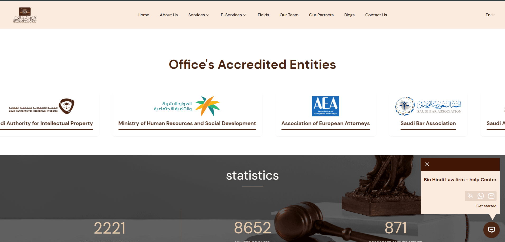
Our initial analysis highlighted usability issues that could make it harder for visitors to move through the website and complete the next step. The experience needed to do a better job of connecting what visitors wanted to know with what the business wanted them to do.
The existing experience made it harder than necessary for users to move through the website and find the information relevant to them. When navigation adds friction, visitors can struggle to reach the pages that matter.
The website did not make its next steps clear enough at the right points in the user journey. A visitor may be interested in a business but still leave if the next action is difficult to notice or find.
A website can contain the right information without guiding users towards an enquiry or another meaningful action. We needed to look at the experience as a complete journey, rather than treating each page as an isolated design.
The Key Question
If someone arrives on the website with genuine interest, does the experience make it easy for them to understand the business and take the next step?
That question shaped our approach to the redesign. Instead of assuming the solution was purely visual, we focused on the experience that connects a visitor's interest to an action.
Effective CRO begins with understanding the existing experience. Before deciding how to rebuild the site, we examined how the layout, navigation and calls to action worked together.
Navigation should help visitors orient themselves without forcing them to guess where information lives. We considered the effort required to move through the existing experience and locate relevant content.
A call to action is only useful when people can notice it and understand why they should use it. We identified ineffective CTA placement as an area that needed greater attention in the rebuilt website.
Visitors need enough context to understand an offering before they act. We considered how content and navigation could work together to make the experience easier to follow.
The website needed to support more than browsing. We approached the rebuild with the intended user action in mind, so conversion considerations informed the design rather than being left until later.
Our Principle
We do not redesign first and ask conversion questions later. Conversion thinking needs to inform the decisions from the start.
We used the analysis of the existing website to guide the rebuild. This meant approaching the project as a conversion problem as well as a web development project.
We started by analysing the existing website and looking for the reasons the experience was not supporting conversions as effectively as it could. This helped us focus on usability and conversion barriers instead of jumping straight into visual changes.
We considered how visitors moved between sections, how easily they could locate relevant information and where the experience created unnecessary effort. The redesign was guided by the need to make the website easier to use.
Calls to action need to appear where they make sense in the visitor's journey. We approached the redesign with greater attention to their placement, visibility and relationship to the content around them.
Instead of focusing only on individual sections, we considered how the full experience could move a visitor from discovering information to understanding the offering and deciding what to do next.
Phase 1
Understand the usability and conversion problems in the existing website.
Phase 2
Rework the experience around clearer navigation and more purposeful calls to action.
Phase 3
Build a website with a more intentional path from information to action.
The new website was developed with CRO as a central consideration. We wanted the design and development decisions to support the visitor journey instead of treating conversion as a separate task.
That meant giving greater attention to the relationship between page content, navigation, calls to action and the point at which a visitor might be ready to take action.
A more considered user journey helps people move between relevant sections without unnecessary confusion. The goal is to help visitors find information instead of making them search for it.
Calls to action should relate to the information on the page and the decision a visitor may be ready to make. We treated their placement and visibility as part of the conversion strategy, rather than as decorative buttons.
Visitors should not have to work out the next step on their own. The experience needs to help them move from learning about a business to identifying a relevant action.
CRO was part of the website rebuild itself. This allowed us to consider the user journey while shaping the experience, rather than treating conversion improvements as a later add-on.
The Bigger Idea
Every extra step, unclear link or overlooked CTA can add friction to a visitor's decision.
The solution is not to add more buttons everywhere. It is to understand what the visitor needs, then make the appropriate next step clear at the point where it makes sense.
Our work moved the project beyond a conventional redesign. We analysed the existing experience, identified usability issues and ineffective CTA placement, and rebuilt the website with conversion-focused decisions guiding the process.
The result of the work was a redesigned website with a stronger focus on navigation, clearer conversion paths and the role of calls to action in helping visitors move forward. It created a more purposeful foundation for the business's online experience.
We rebuilt the website with conversion rate optimization as a core consideration, rather than treating CRO as a set of changes to make after launch.
The redesign placed greater emphasis on helping visitors navigate the experience, find relevant information and identify the next step.
Calls to action became a deliberate part of the conversion experience, with attention to where visitors may be ready to act.
The rebuilt website provides a stronger starting point for future measurement, testing and refinements as verified performance data becomes available.
Why This Matters
When a website is difficult to navigate or its calls to action are not easy to find, potential customers can struggle to move forward. Reviewing the user journey can reveal opportunities that are easy to overlook when the focus is only on visual design or traffic growth.
We have not included a percentage conversion lift, additional lead volume or revenue increase because verified before-and-after performance figures were not provided for this project.
Small usability decisions can shape the entire conversion experience.
Design needs to support the visitor's goals and the business's goals. A visually appealing page can still create friction if people cannot find information or act.
A call to action should be visible, relevant and connected to the visitor's context. Placement is part of the journey, not just a styling detail.
Before spending more to attract visitors, review what happens after they arrive. Improving the experience can be an important part of a wider growth strategy.
We can help you review your website, identify friction in the user journey and build an experience that makes it easier for the right visitors to take the next step.